Overview
Founded in 2017, Milky Mountain's brand was drowned out in Ghana's ever-growing snack beverage and baked sweets category. The founders decided it was time for a complete makeover of the brand and its visual identity, and tapped Don't Be A Stranger to deliver a rebrand that would reintroduce Milky Mountain to its audience, distinguish its image in the category, and reflect the brand's mission to bring fun and sweetness in every sip and bite. We were also tasked with using design to communicate the tagline "Over the top!"
Challenge
A look into the category behavior revealed weaknesses common to many brands in the space, such as a common color palette, similar cursive font styles, and a heavy focus on simply explaining the taste of snacks, rather than a rich expression of the feelings of excitement and the "high" that comes from enjoying one's favorite sweet snack.
Solution
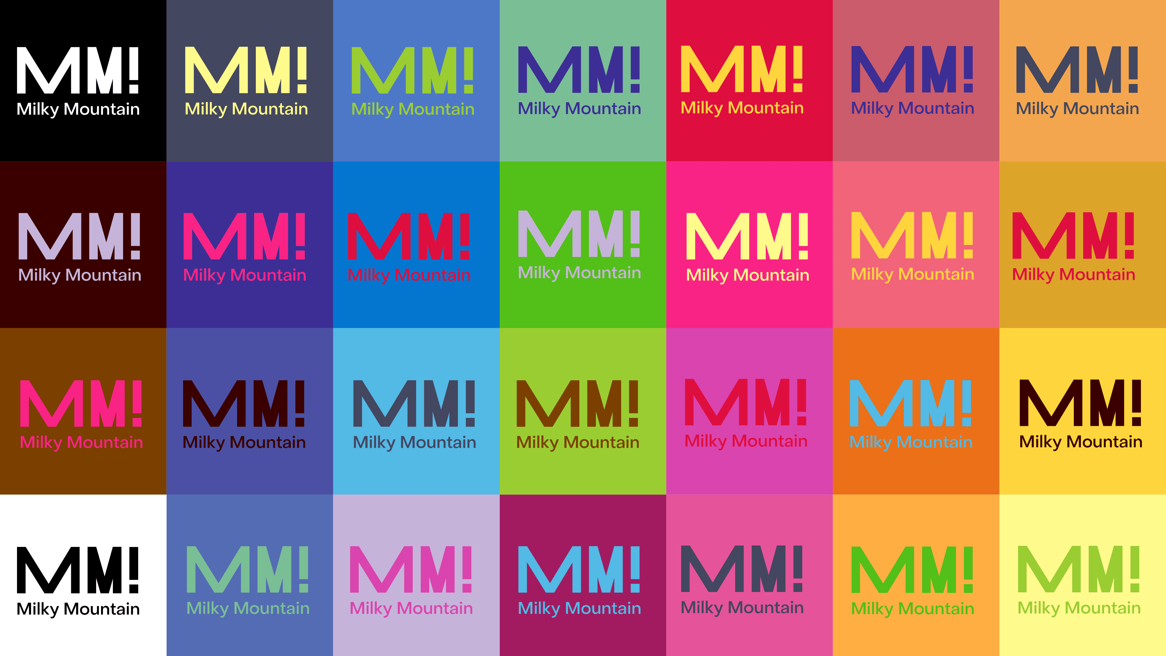
Don't Be A Stranger therefore decided to tap into a familiar, fun feeling - a sugar rush - as the big idea that would drive design. The strategy was to express the bubbliness, the unpredictable jumpiness and excitement that comes from a sugar rush, through typography, color and a new logo, and to allow positive emotion and joyful expression to come through in every element of Milky Mountain's visual identity and language.


